The new ‘Liquid Glass’ design makes the biggest change in aesthetic for Apple’s iPhone and other devices in years.
“Liquid Glass” on iPhone refers to Apple’s new translucent, fluid-like interface design in iOS 26, making app elements appear like layered glass that refracts background content for depth, but it can be adjusted or toned down in Settings > Accessibility > Display & Text Size > Reduce Transparency or via new toggles in iOS 26.1 for a less intrusive, more opaque look, as some users find the original effect distracting or hard to read, especially with animations.
What it is:
- Visual Effect: A design system that gives UI elements (icons, toolbars, menus) a transparent, glass-like appearance, making them sit above app content.
- Dynamic & Animated: It subtly shifts, reflects, and adapts to device movement and context, creating a sense of depth and focus.
- System-Wide: Affects the Dock, Control Center, notifications, and app interfaces.
Why some users dislike it:
- Distracting: Animations on buttons and icons can feel unnecessary or jarring.
- Obscures Content: The translucency can make text and controls hard to read, especially in Dark Mode or with busy backgrounds.
- Apple’s iOS 26 “Liquid Glass” design brings complaints about poor readability (blurry text, low contrast), visual confusion (distracting animations, inconsistent effects), and performance issues (lag, battery drain), especially for users with vision impairments such as Keratoconus, or on older devices, leading to eye strain and headaches, though some settings can mitigate these problems.
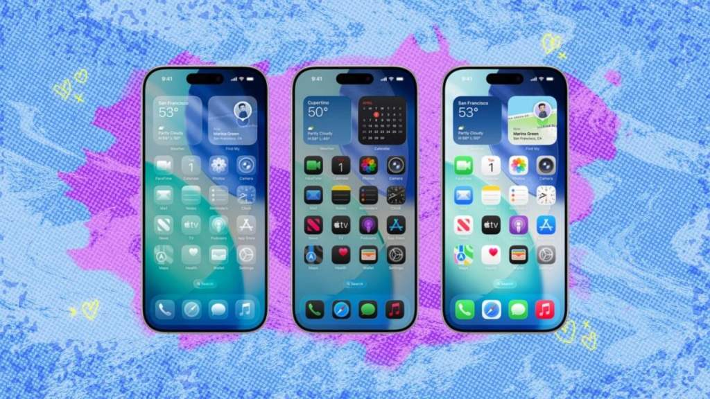
The Liquid Glass redesign has changed the shape and look of the icons and widgets on the home screen. In addition to the reworked standard app icons, you can now turn them all colourless and translucent, tint them with your choice of colour or use a dark version of the original icon.
Notifications and other elements now bounce into view from the top of the screen. Widgets display at the bottom of the lockscreen and the clock can dynamically scale in size depending on how many notifications take up the display.
Dynamic and hiding buttons
Various buttons now shrink away when you don’t interact with them. For example, the camera app has been streamlined to hide additional modes behind a slider or big pop-up menus. The address bar and navigation buttons in Safari now condense down to a small button at the bottom of the screen as you scroll. To get to your tabs and controls you need to swipe the address bar button upwards or press the three-dot button.
User Opinions
What do you think of Apple’s Liquid Glass? Share your thoughts as someone with Keratoconus on our Facebook Group – http://www.facebook.com/groups/keratoconusgb www.facebook.com/groups/keratoconusgb

Leave a comment